Home page
One of the largest banks in the world and the largest in Europe. Like other large banks HSBC is in a moment where they are challenged by digital bank start ups and are looking to modernise the service they give to their customers.
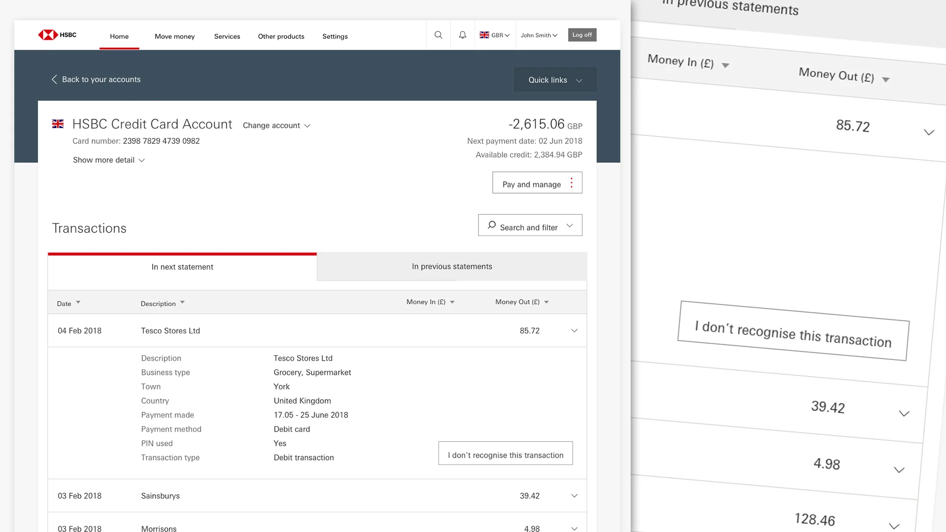
I was brought into a UX/UI team challenged to redesign the experience on top of the same technical framework. One of these areas to work on was the home page and account details for browser logged on customers.
Research
I jokingly call one of my colleagues Sherlock Holmes, because of his ability to find information and investigate an area of interest to the max. I think this is a great thing and we tried to take information from a lot of different areas and cross reference it to triangulate which then fed into our design decisions. I find having a few sources of information is better than just one.
Call centre interviews
Current journey data
Customer interviews
Complaints
New experience principles
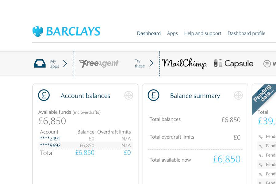
Competitor offering
Current technical framework
Workshop
Armed with new found knowledge we replayed the take outs back to ourselves and as a multi role group, got to work, prioritising features and sketching out visions of how it could be.
Some sketches from initial workshops
Options to test
We decided to wireframe out 3 of those as separate options ready for customer testing, the idea that we may have a clear winner so we can develop it further.
MVP wireframe and viewports
Turns out that we didnt have one clear winner, but the list format did come on top, we then combined that with the different winning features to create a really useful banking Frankenstien. We also started to think about the accounts details page where a lot of the time the customer would navigate to from the this page.
High fidelity
Once we were happy with this wireframe, we took it up a notch and looked at a high fidelity design and also added the accounts details page for further testing.
Baseline UX
From the MVP wireframe onwards the Home Page tested well all the way through the project we then took that baseline MVP UX and took it into build. This meant stories were written and business added anything that was needed for the local market into project increment. From here we built in 2 week sprints.
Future thinking
We then set to work on new features working our way out of an MVP into something more rich. We ran customer test cycles every 6 weeks across 3 different entities and multi customer segments to get a good cross reference of feedback.
Global rollout
From here the home page is being rolled out for customer use around the world. We then worked on what the delta was, this is the difference between the core build and any customisations a particular country may need to meet their banking culture and standards. Feedback has been positive.


