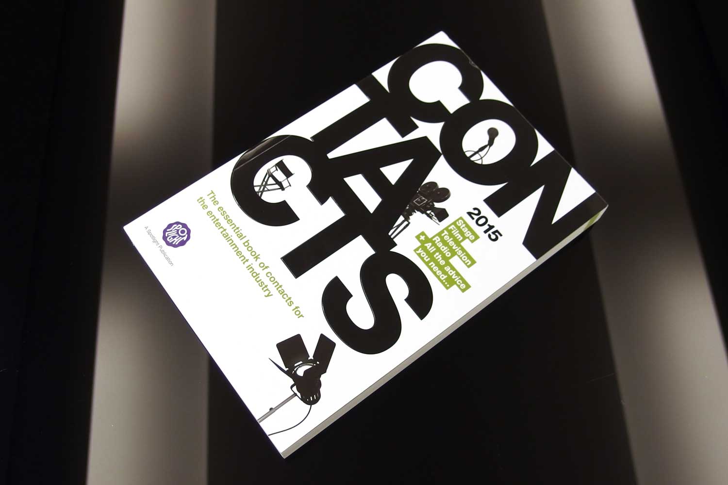
Spotlight are the number one name in casting studios in the UK, based in Leicester Square, London. Part of the industry is knowing people with the right skills sets, this is where ‘Contacts’ comes in. ‘Contacts’ is a book produced by Spotlight that has listings of over 5,000 companies, services and individuals across the entertainment industry.
The printed book needed to be articulated for digital.
The brief
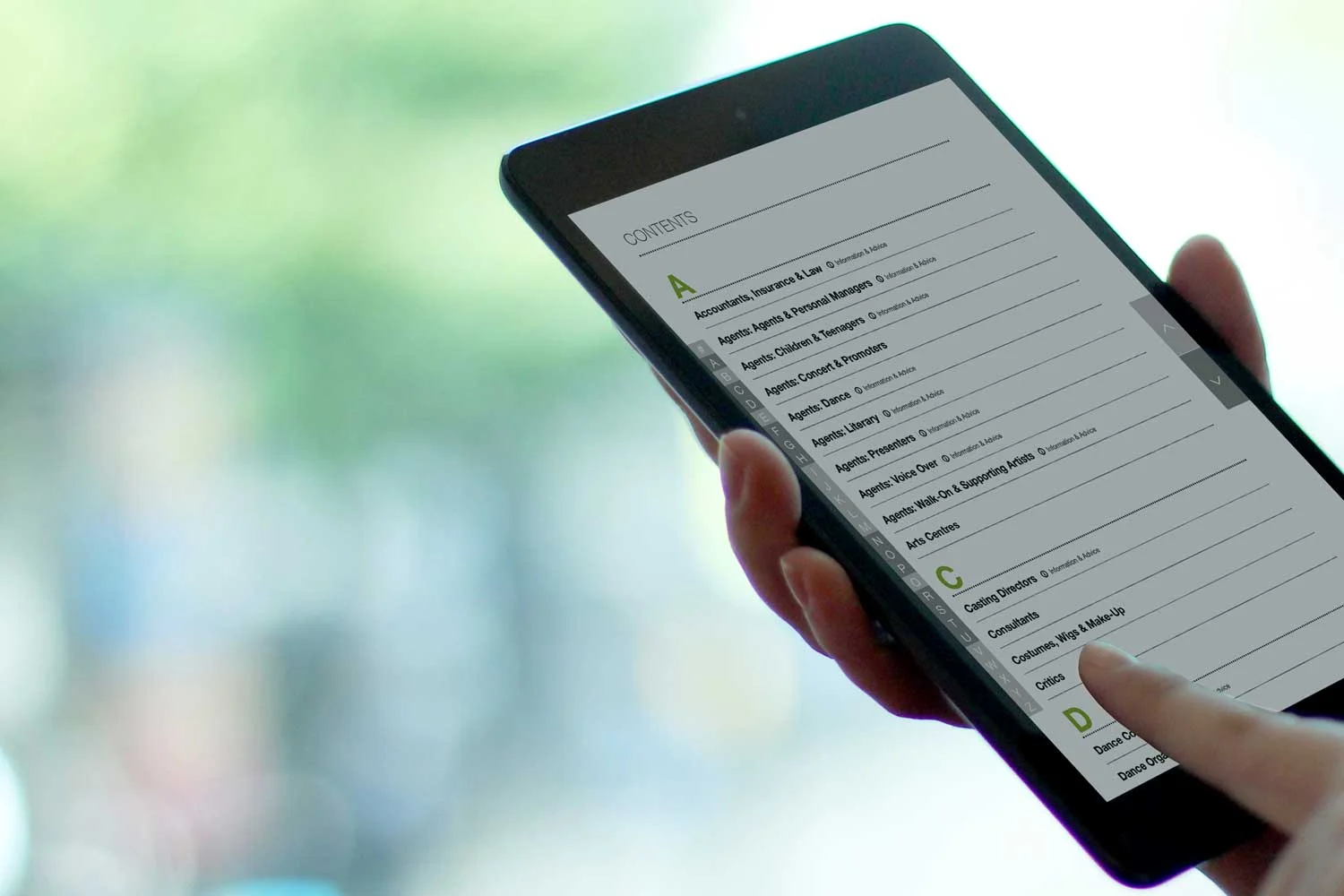
Spotlight was to digitise the book into a digital publication for iOS and Android. The new digitised book would need to live alongside the printed material in terms of structure and style so that people who were regular customers could make the transition and still feel comfortable.
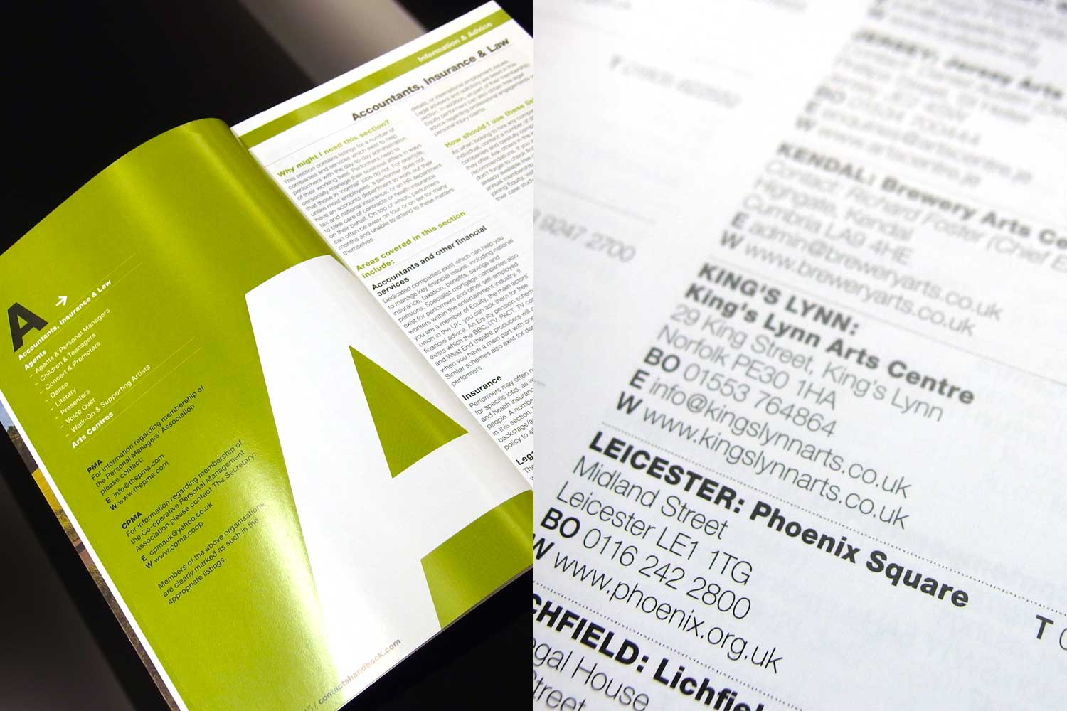
Category page, information and advice / Listings within the printed book
The current book
The book contained listings, advertisements and also advice and industry insight in the form off additional information pages. The book was structured using A to Z listing of categories, followed by sub categories and then the listings of contacts. This all needed to be aligned in the digital version we were creating.
Broad sketch of the category and listing page structure
Design challenge
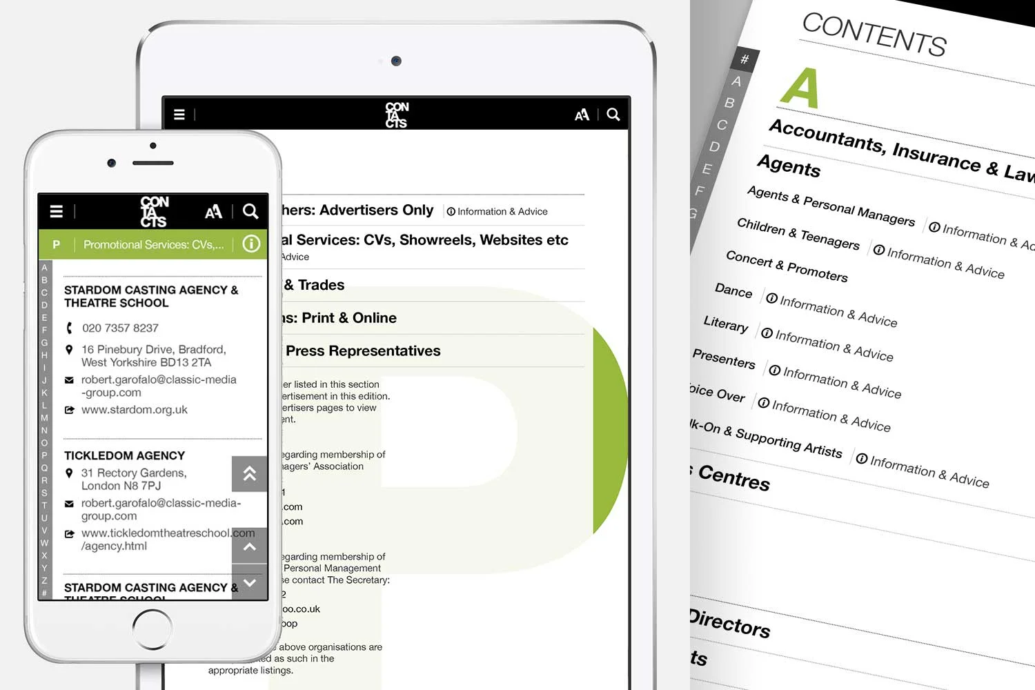
The thing about listings is that everything on the page was clickable, I made the choice early on to not follow convention and make the clickable items a strong colour, this would have led to colour overload. Instead I went completely in the other direction and made everything the same colour and concentrated on font weight and style to indicate what should catch the attention more and then therefor be clicked.
Category and listings page visuals
Motion design
The overall feel was kept purposefully very simple so that the information could be consumed without any over designed elements getting in the way. To keep the app feeling nice, slick and modern I gave movement as much consideration as the look. Going for very fluid and satisfying transitions as you move through the information.
Easy control access
The controls on the page where positioned and sized for thumbs being used to flick between sections. The A-Z allowed fast navigation to the contacts. If the name of the contact is known then the user has the ability to search.
Consistent navigation display across all devices
Tasks such as navigation and search use full screen to aid focus
Boarding screens explain how to use some of the Pugpig platform features
On mobile when the customer scrolls the header retracts to aid focus
