

The Shopping City is a 70’s built shopping centre in my home town of Runcorn. With a new bridge nearing completion and with it new custom it was an important moment for the centre and plenty of problem points to solve.
A Glorious past
First it is important to understand the history of the centre. Designed by Fred Roche C.B.E., the Chief Architect and Planning Officer of the Runcorn new town and opened in 1972 by Queen Elizabeth II.

The Shopping City with original white tile cladding and 'egg timer' logo

The Shopping City was a super modern high quality shopping destination and the largest fully enclosed shopping centre in Europe, undercover parking for 2,200 cars, 2 bus stations and inside almost every top high street brand of the time.
The Shopping City was designed by Runcorn New Town Architect Fred Roche C.B.E. who went on to design Milton Keynes.
The centre was more than just shopping, the vision was to create a new town centre for the new town project in Runcorn so it incorporated a post office, cinema, public house, bus stations and it was also situated with a police station, a hospital, law courts and office space.
The Shopping City was designed as a new town centre
Legacy leaves a mixed bag
Over the years the shopping centre went through a few changes of ownership. It seemed to me that each time it changed hands and decisions were made the purity of the original design would be polluted with some bad design decisions.

Shopping City
1972 - 1995
A super modern, high quality shopping destination. The largest fully enclosed shopping centre in Europe, undercover parking for 2,200 cars, 2 bus stations and inside almost every top high street brand of the time. This was the heyday.
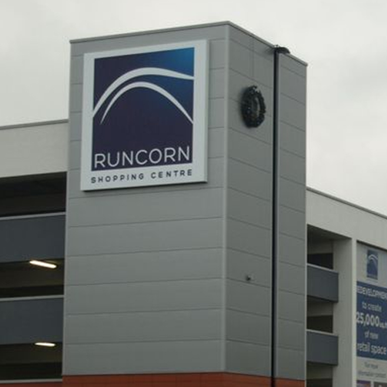
Runcorn Shopping Centre
2013 - 2017
This was the name of centre until I was involved in the rebrand. Since 2013 there has been investment in the upgrade of the carparks and huge efforts made to turn the centre around. The struggle is to get more high street brands into the centre.
Names stick
As far back as I can remember, the people in Runcorn, when in conversation about the shopping centre, had always called it 'The Shopping City'. From the information I could gather, the rebrands had almost zero impact on the public in regards to calling the centre anything but its original name or ‘The City’ for short. So why not embrace it?

Survey:
"What's this building called? "
The conclusion was overwhelming, this was backed up with a Facebook survey which gave similar results.
Word of mouth
The worst thing about this identity crisis was that the word of mouth carried over to social media which meant that the conversation was going on without the centre being involved.

Word of mouth travelled onto social media
Clean slate and get aligned
From each identity change there were left overs from the previous which meant the place became a mixed bag of road signage, pedestrian wayfinding, advertising and colour styles etc. On top of that the surrounding housing estates had existing original signage from the time is was built.

BEFORE: Signage to carparks that don't exist anymore

BEFORE:Way finding mixed with advertising
One major bad decision was to change the name away from the shopping city in the first place. Not only had word of mouth stuck firm but also the local signage infrastructure was geared as ‘shopping city’
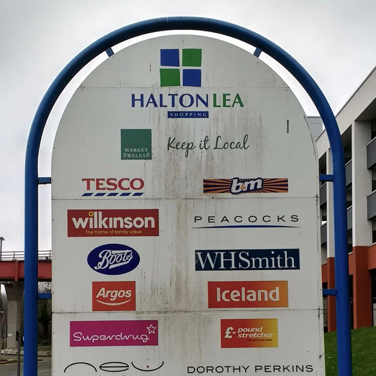
BEFORE: Halton Lea signage

Existing housing estate signage
In Runcorn the local landmark is the Silver Jubilee Bridge. The shopping centre incorporated this into their logo design, but this just blended with the other businesses that used the bridge as a logo mark and looked more like a 'Welcome to Runcorn' sign. It was corporate in feel and with the new Mersey Gateway bridge on the horizon would immediately feel dated.

Silver Jubilee Bridge
Old logo using bridge
Look to the past to inform the future
The truth is that they got most of it right the first time. The clean logo that had the word shopping in it. The people graphic within the centre and advertisements to say community and shopping at a glance. The more memorable colour coded car park. The clear way finding and clean typography.
I just needed to find a way to get back to this common sense approach and hit these key areas again in a modern way.


Stick with plan A
So I set about creating one option for the client, they liked this direction so I spent the time crafting the solution rather than creating multiple choices. I also wanted the logo to be cheerful, as the architecture itself has a lot of concrete and can be quite brutalist in feel from some angles.
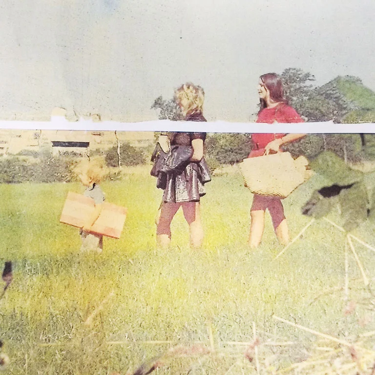
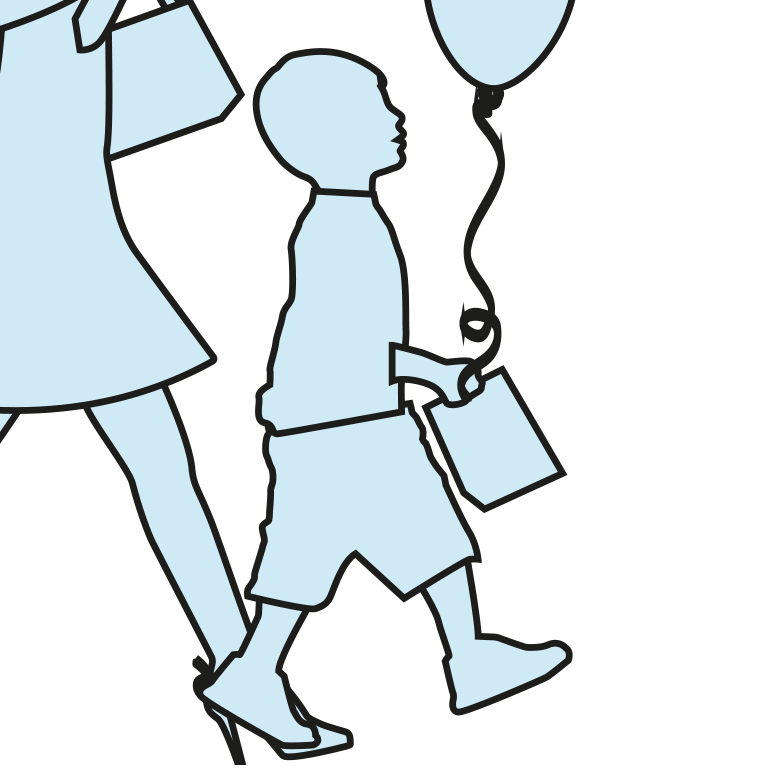
I knew as soon as I had the go ahead that I wanted to recreate the people graphic from the indoor signage I had seen as a kid. This time it would be clear that it is a family shopping.


Responsive identity
Modern identities need to be responsive and this one especially so because it needed to flex from a social icon up to large signage. This meant a mark and logotype that could work separately if needed and the mark and identity to fit proportionately within a square.

Responsive identity design: Linear, stacked , square and icon
Consistent, clean and budget considered
I chose Open Sans so I knew that they could put this across print and digital. It also helped with the budget too, but the main thing is that it is clean and clear with a friendly feel. I knew it would work well for the internal wayfinding signage and the large sign idea I had.

It was important the the typeface used was very clear and could go online also
Customer Journey

Customer journey for new customers
Discover
Approach
Because of the new Mersey Gateway bridge the road signage is really important. For new customers it could actually be the first touchpoint which I think would be most probably followed with a search online.

Road signage is now clean and clear, says shopping at a glance and communicates free parking
Tower signage
These are huge 5m by 5m square signs made from printed outdoor fabric that is stretched across a frame and retained with clips. The fabric lets light shine through for LED illumination at night. There are four of these signs located on each carpark at each corner.

Tower signage

Frames are very large (5m x 5m)

Backlit banner material to stretch over frame

Signage LED lighting
Park
Colour coded car parks
The centre was designed with four equal entrances, there is no main entrance. Each corner of the centre has a car park that is completely undercover. This is excellent but also presents a problem, which car park do I use to get closer to the shops I want to go to? How do I remember which car park I parked in if they all look the same?
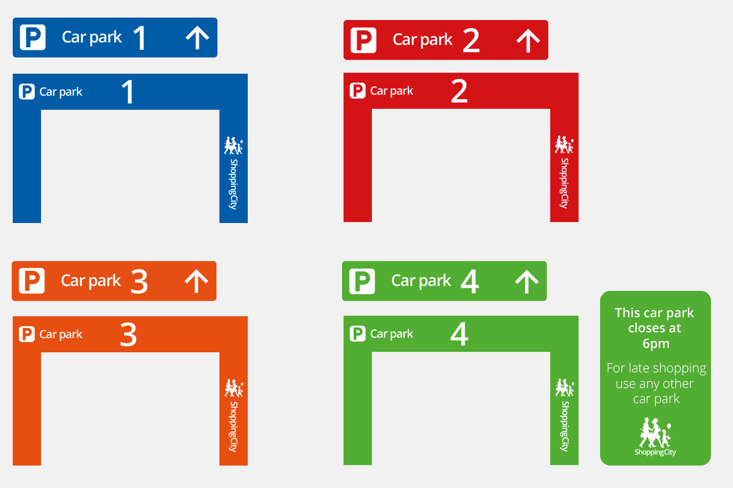
I know which car park to use
Bringing back the colour coded car parks was an obvious common sense design decision because not only did people need to remember where they parked but they also needed to identify the car park on approach. Colour coding helped all of this. The numbers of the car parks remained.


I remember where we parked
The main aim is to link the colour coded car park with shops and an entrance. Four entrances is a challenge, but with every opportunity to reaffirm the colour in the customers mind, customers are a step closer to recalling their car park later.


Ramp signage to the shops colour coded to the specific car park

Exit and other functional design elements use yellow across all carparks
Walking from the car parks
When people leave the car they need direction too as the best route for them is to use the walkway and stairwells and not the slopes that the cars use. All pedestrian signage uses colour coding to reaffirm the recall of what car park they have parked in.


Walking to the Shops
The internal wayfinding was made up using the actual store logos, this lead to a mix and competition of graphics with no directional arrows apart from those that pointed out where the toilets are located. All signage also had the shopping centre logo displayed which was of no use to the customer.

I decided that a clean, modular system would work much better, with each store represented with typography rather than a logo. This was more consistent and meant there was less cognitive load on the user to work out all the different shapes and colours that a logo grid brings.


Colour was instead reserved for being used for the coded car parks, toilets, baby change, bus stations and other facilities like the Library, Police Station and Hospital. This was all set against a neutral backdrop where the typography had good contrast.

Once I'd overhauled the signage both inside and out, it was much easier for the customer to know where they wanted to go. This makes the shopping experience much more relaxed and hassle free. It was then over to the shops to convert those relaxed shoppers into sales.