

UVGI Systems (Ultraviolet Germicidal Irradiation) produce air sterilisation units that remove airborne viruses from indoor air for venues such as hospitals, offices, commercial premises, hotels, schools, entertainment venues, pharmaceutical manufacturing and clean rooms.

Start up
UVGI was a start up company and needed everything from scratch. Starting with branding with that rolling through to promotional material and stationery.
We started with researching the company and benefits of the product. What the products did and using what methods. We also read into the research being taken out by the University of Leeds and visited the factory where the air sterilisation units were being manufactured and the units were photographed.

Single room air conditioning unit, top right an in-duct air conditioning unit and bottom right the UV lamps.
Identity
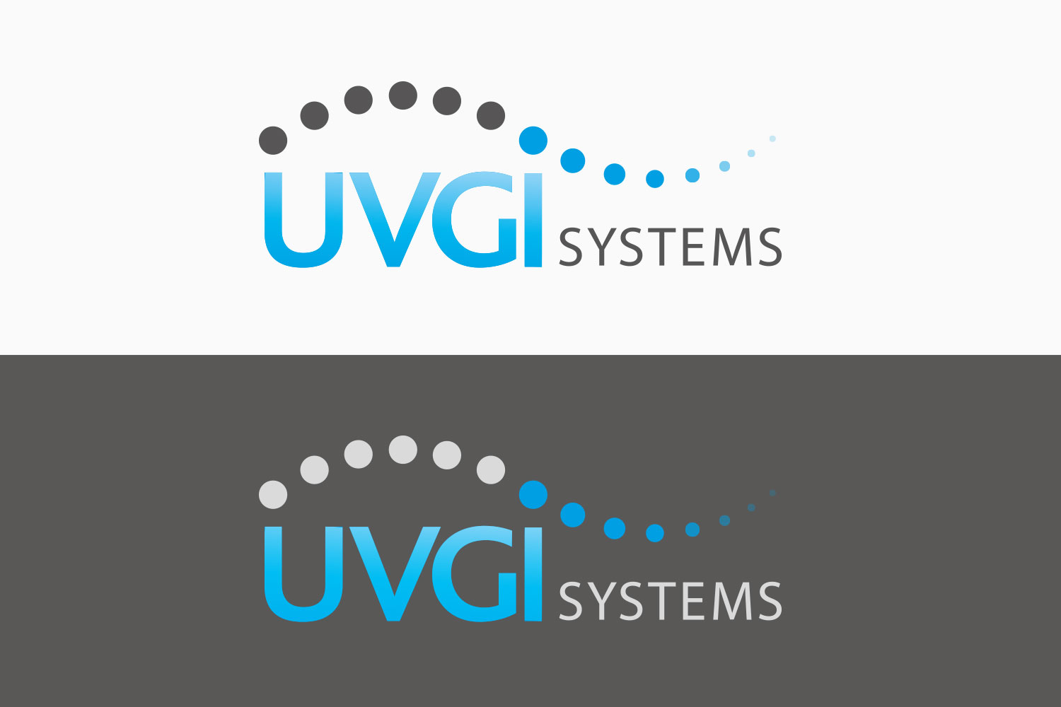
I wanted a very clean look to the brand. The product was all about purification so I wanted the same feel. It was important that the brand carried authority so similar colours to the NHS was chosen along with uppercase type setting to carry that feeling though into the identity.
Font and colour pallet

Rationale
The dots represent airflow, in the logo the wave of air can be seen going from dark to light blue to represent the air being purified, this happens on the ‘i’ which stands for ‘irradiation’. I wanted to remind people that air is all around us so some key photography of people was made out of dots and given an airflow treatment.

Roll out
Once this was in place I designed the brochure and stationery. in the brochure I used the circles to contain images and the airflow photography on the covers and the colour scheme to highlight facts.


