

The Ryleys School, located in Alderley Edge, Cheshire is a preparatory school for boys and girls aged between 3 and 13. It was founded in 1877 and was an all-boys school for 132 years until 2009, when it began accepting girls for the nursery and junior classes.

The Ryleys Preparatory School. Established 1877.

The brand required an update and to incorporate the move to being a mixed school
Changing a 132 year perception
The challenge was to help The Ryleys transition from an all boys school to a mixed school from an identity and branding point, rolling it out offline. We needed to cut through that perception but still respect the tradition and reputation for quality that The Ryleys is known for.
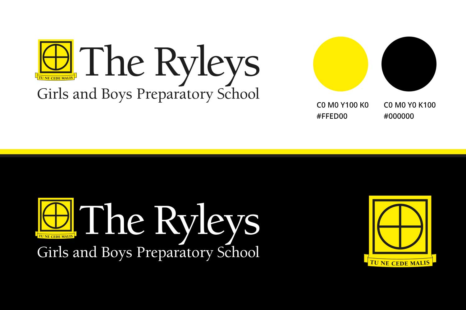
The new branding has a modern feel and incorporates the move to a mixed school
The school now accepted girls as well as boys and this needed to be upfront as the school had an established name as an all boys school so we built it into the supporting text of the logo.

Modernised but not too much
The font 'Berkeley' was chosen, with upturned 'eye' on the "e' and nice thick and thin descenders, it had some the characteristics of the older type and overall a friendly and modern feel. This fitted with the modern facilities the school offered.

The photography had be convincing that girls already attended the school.
Photography of the future
I then organised a shot list and art directed the shoot with the brilliant photographer Tracey Gibbs and over two days captured the school as it will look when girls are introduced in the new year.

The shot list covered as much of the variety of a day at The Ryleys as possible.
Spreading the word
The branding elements and the photography were then used to produce a brochure. New copy was written to incorporate that the school going forward was going to be mixed. The concept ‘A perfectly rounded education’ became a running theme.

School Prospectus with new branding.

Front cover with embossed sphere image and spot UV.


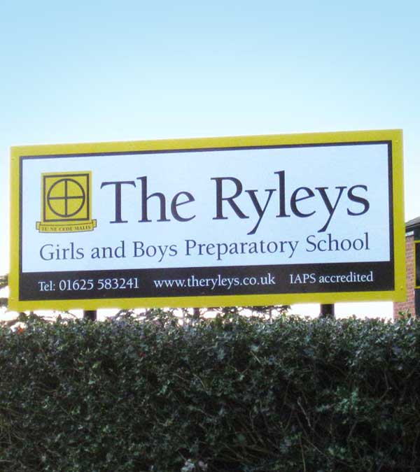
School entrance signage.

School games field signage.

Stationery material.